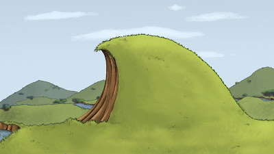
This is the first background coloured and drawn from a layout I had worked on. It's the end of a long opening pan and one of the first things you will see in the animation. I adjusted the colours the Steph had been using slightly to make it more vibrant and more in the style she had originally pictured. I think this has worked quite well and I look forward to doing some more in this style.
I have discovered some new brushes in Photoshop which I used for the out line and shading. They give a more pencilled and hand drawn feel to the image.
1 comment:
i like haz, but perhaps if your going for depth of field (ie by blurring the background hills slightly, dont forget to blur their outlines ever so slightly too. it looks a lil harsh when you view it, as the outline is in focus but the hill is blurry ^_^
Post a Comment