Wednesday 31 March 2010

Textures, textures everywhere...


These are a few of the tent textures Ive done for Adam. I really like the blue and yellow John Peel design. Although it was very difficult to work out where the stripes needed to go on the UV map.

Tuesday 30 March 2010

BEER!!! A student's necessity...

I was asked to design some lager cans using typical colours and styles. Adam gave me a few examples and I looked at a few others on the Internet to get a clearer idea. I'm quite happy with the level of detail in these designs and hope Adam is too.


One thing that I could of thought about more when designing them is that the main logo is normally repeated twice on the can and less space if left for the ingredients and warnings etc.

Monday 29 March 2010

Editing Ground UV

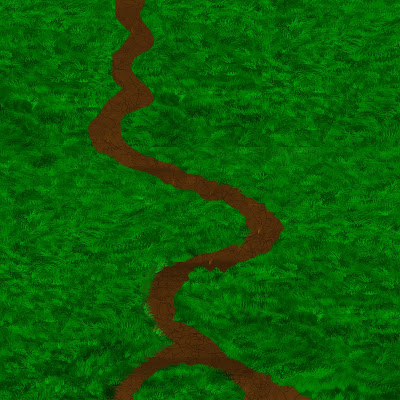
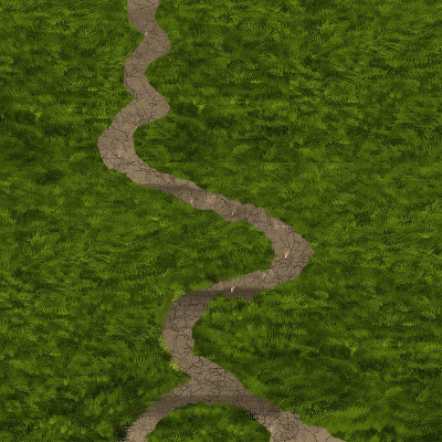
Adam had to slightly alter the size of the of the texture map, making the path longer and stretching out the existing image. I edited the work I had already done to create the new texture map.

The colours were a bit bright for the scene, so Adam gave me some photos of the kind of tones he was aiming for and I adjusted a few things in Photoshop. I ended up with this final texture which looks much better and Adam was happier with it.

Friday 19 March 2010

Production Report: Preproduction

For this project we were set the task of creating a pre-production bible of one of five Dr Who scripts. We started off working in groups and researching all of the different time periods the scrips were set in. This helped to give us a better idea of which script we wanted to carry on looking at. I chose the script called Turn Left. It is set in a city not on this planet, their culture is similar to Earth's Oriental Chinese culture.

One of my main influences for the design of this planet was from the film Blade Runner, with the grotty looking streets and tall imposing buildings. I also used this film to get ideas for the style of my characters, especially Donna, with her punkish hair and face paint.

I drew several designs for each character, drawing from each, my favourite features and styles. When I had roughly got what I was looking for I refined my designs until I had the character I wanted. I had looked at loads of market stalls and images of Shanghai and also researched Chinese interior design, until I had a clear image of where this animation would be set. Before I started on my final background design I had the exact image in my head planed out. Knowing the exact personalities of my characters helped me to pose them in the final concept work, and also knowing the background helped me to get the setting and lighting how I wanted it.


I created these pieces of 'art' by using acrylic on brown paper. I decided to paint them quite large so I could get the extra detail I needed easily. The painting of the market street is the biggest and is almost 2 metres long.

I wanted to continue the theme of rough, dirtiness and brown paper throughout my bible. I also used a Chinese style font for the titles. I tried to arrange it simply so there wasn't too much on each page to confuse people as they look through it. And I also arranged it in clear sections, showing development to the final concepts.

I think the concepts work the best because I feel you really get a sense of character through their poses. However, they are only two of them and I would of liked to do more of them. One of the major problems I found with this project is that by doing the painting so big, I found it difficult to digitalize them. Taking photos with a digital camera always enhanced the shiny paint and whited out sections so I had to take them at an angle and warp them back into shape on Photoshop.

I think if I do another pre-production project I will defiantly try to improve my concept art skills as this is an area I an very interested in. I will also try to consider the practicalities of my medium before I start.

Monday 15 March 2010

Essay... Fun times

This has been the part of the course I have been dreading.... Planning for the dissertation. 1000 words my not seem like a lot but I always get so confused and cant get started. I want to write about character design after watching Spirted Away again. But after a chat with Ann we decided that's a very broad area and I don't really know which direction I would take it. I have finally come to the decision of looking at how females are represented in animation. I have also found the three texts I want to look at in my first literature review. They are:

  • Paul Wells, Understanding Animation
  • Sandra Law, Putting themselves in the pictures
  • Stuart Hall, Representation: Cultural Representations and Signifying Practices
These texts all explore representation and how women are represented in animation and media.

Texturing

He are some lovely grass texture I created using different grass brushes. I still need to work on the mud path section.

Life Drawing... Uploaded!

I have realised that I haven't uploaded any of my life drawing from year 2. So here are some of my favourites....

(life drawing)

I think that my confidence in my drawing ability has grown a bit since the beginning of the year. I also think that my idea of how perspective works has gotten better, however I do still need to improve on this quite a bit.

I really enjoy trying to get the lighting right and enjoy working with chalk to create highlights.

The Final Product!

This is the final look of my design bible. I decided to continue the theme of brown paper for a rough look and also use Chinese style typography.


Saturday 13 March 2010

Concept Work


In this concept there is the Doctor, Donna and the merchant. I really like the design of the merchant character in this as he looks old and grizzly and like he has a strong personality. I'm still unsure on the shading on the ground, but I want it to be obvious that it's done on brown paper.


I was worried with this concept design that the characters wouldn't stand out enough against the background, however I think they are easily distinguishable. I also had problems working out the perspective and scale in this one, and think that maybe the characters are slightly too small in comparison to the objects in the background. I think that the fortune teller could be leaning in a bit closer to Donna.

Wednesday 10 March 2010

Backgrounds and Characters

I decided to use acrylics for the final designs of my backgrounds and characters. This is because its easier to get a vibrant colour compared to other materials such as water colour or coloured pencil. I wanted quite a crisp feel to it all with both the backgrounds and characters bright, however I still wanted it to be easy to distinguish between the two. To do this I outlined some of the characters with a black fine liner.


These are my painted up versions of my characters. I Have decided to keep the fortune teller as she is and have made the Doctor look slightly older.


This is the fortune tellers room. I decided to use a lot of red and gold in this scene because they are very popular colours in China. I tried to stick to the description of the room in the script, but I added some traditional ornaments. These hint at the fact she is in a higher class from the market folk.


This is a long pan down of an alley with the market down below. I found it difficult deciding how I wanted to paint the pagodas. I settled on just painting the silhouette of each one in different shades of grey. For the objects on the market stalls I wanted bright exotic colours so I used purples, greens and reds.

Tuesday 9 March 2010

A Load of Rubbish, in a Good Way

For the the third year project I am working on Adam's project 'Stress Fest' and I've been assigned the task of texturing some of the models as I can't model very well. Matt and Simon are modelling and also doing some texturing. I will need to learn how to UV unwrap to help speed things up.

I have been asked to create some textures for some festival bins, Adam gave me a rough idea what he wanted with some research photos and some examples of his own.


These are my first attempts, Adam wanted them a bit more rough looking which I agreed with. So I went back to my designs and used a grunge brush to beat them up a bit.


I now need to design a couple more to make the total different designs up to 8. And also the blue stripy bin I'm not very happy with so I may revisit the design of that one too.