- Paul Wells, Understanding Animation
- Sandra Law, Putting themselves in the pictures
- Stuart Hall, Representation: Cultural Representations and Signifying Practices
Monday, 15 March 2010
Essay... Fun times
This has been the part of the course I have been dreading.... Planning for the dissertation. 1000 words my not seem like a lot but I always get so confused and cant get started. I want to write about character design after watching Spirted Away again. But after a chat with Ann we decided that's a very broad area and I don't really know which direction I would take it. I have finally come to the decision of looking at how females are represented in animation. I have also found the three texts I want to look at in my first literature review. They are:
Texturing
He are some lovely grass texture I created using different grass brushes. I still need to work on the mud path section.

Life Drawing... Uploaded!
I have realised that I haven't uploaded any of my life drawing from year 2. So here are some of my favourites....
(life drawing)
I think that my confidence in my drawing ability has grown a bit since the beginning of the year. I also think that my idea of how perspective works has gotten better, however I do still need to improve on this quite a bit.
I really enjoy trying to get the lighting right and enjoy working with chalk to create highlights.
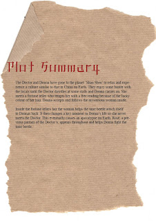
The Final Product!
This is the final look of my design bible. I decided to continue the theme of brown paper for a rough look and also use Chinese style typography.


Saturday, 13 March 2010
Concept Work

In this concept there is the Doctor, Donna and the merchant. I really like the design of the merchant character in this as he looks old and grizzly and like he has a strong personality. I'm still unsure on the shading on the ground, but I want it to be obvious that it's done on brown paper.

I was worried with this concept design that the characters wouldn't stand out enough against the background, however I think they are easily distinguishable. I also had problems working out the perspective and scale in this one, and think that maybe the characters are slightly too small in comparison to the objects in the background. I think that the fortune teller could be leaning in a bit closer to Donna.
I was worried with this concept design that the characters wouldn't stand out enough against the background, however I think they are easily distinguishable. I also had problems working out the perspective and scale in this one, and think that maybe the characters are slightly too small in comparison to the objects in the background. I think that the fortune teller could be leaning in a bit closer to Donna.
Wednesday, 10 March 2010
Backgrounds and Characters
I decided to use acrylics for the final designs of my backgrounds and characters. This is because its easier to get a vibrant colour compared to other materials such as water colour or coloured pencil. I wanted quite a crisp feel to it all with both the backgrounds and characters bright, however I still wanted it to be easy to distinguish between the two. To do this I outlined some of the characters with a black fine liner.


These are my painted up versions of my characters. I Have decided to keep the fortune teller as she is and have made the Doctor look slightly older.

This is the fortune tellers room. I decided to use a lot of red and gold in this scene because they are very popular colours in China. I tried to stick to the description of the room in the script, but I added some traditional ornaments. These hint at the fact she is in a higher class from the market folk.

This is a long pan down of an alley with the market down below. I found it difficult deciding how I wanted to paint the pagodas. I settled on just painting the silhouette of each one in different shades of grey. For the objects on the market stalls I wanted bright exotic colours so I used purples, greens and reds.
Tuesday, 9 March 2010
A Load of Rubbish, in a Good Way
For the the third year project I am working on Adam's project 'Stress Fest' and I've been assigned the task of texturing some of the models as I can't model very well. Matt and Simon are modelling and also doing some texturing. I will need to learn how to UV unwrap to help speed things up.
I have been asked to create some textures for some festival bins, Adam gave me a rough idea what he wanted with some research photos and some examples of his own.


These are my first attempts, Adam wanted them a bit more rough looking which I agreed with. So I went back to my designs and used a grunge brush to beat them up a bit.


I now need to design a couple more to make the total different designs up to 8. And also the blue stripy bin I'm not very happy with so I may revisit the design of that one too.
I have been asked to create some textures for some festival bins, Adam gave me a rough idea what he wanted with some research photos and some examples of his own.
These are my first attempts, Adam wanted them a bit more rough looking which I agreed with. So I went back to my designs and used a grunge brush to beat them up a bit.
I now need to design a couple more to make the total different designs up to 8. And also the blue stripy bin I'm not very happy with so I may revisit the design of that one too.
Subscribe to:
Posts (Atom)